For this project, I transformed a basic $40 IKEA Moppe drawer unit into a colorful, reversible storage piece with two completely different looks. One side became a bright explosion of pink, blue, and purple patterns, while the other side became a darker, moodier apothecary-inspired drawer set. I wanted this makeover to feel fun, useful, and flexible — perfect for someone who loves bold color but also wants the option to switch things up.
This DIY makeover included staining, priming, painting, adding contact paper, creating custom drawer pull placement guides, drilling holes, attaching label pulls, and figuring out how to make the drawers reversible. It was a big project, but the finished result turned out so worth it.
Starting With the IKEA Moppe
The IKEA Moppe is such a great blank canvas for a DIY makeover because the simple wooden drawers can go in so many directions. I had wanted to customize this drawer set for a long time, and I finally decided to go all in with a design that felt both colorful and practical.
The plan was to stain the wood darker for a classy apothecary look on one side, then paint the opposite side of the drawers with bright patterns for a totally different vibe. That way, the same drawer set could be flipped depending on my mood or how I want my art space to look.
Staining the Wood
The first step was staining the wood to give the drawer unit a darker, richer finish. Since I live in an apartment, I ended up working outside on my patio while basically hiding in the bushes so no one could see me talking to myself while filming. I also reused a Paw Patrol tablecloth as a protective surface, because I love finding ways to reuse things when I can.
I skipped staining the drawer fronts because those were going to become the colorful painted side later. Once the stain was finished, I already loved how much warmer and moodier the wood looked. It immediately gave the Moppe a more finished, grown-up feel.
Priming the Drawer Fronts
Before adding color, I primed the drawer fronts white so the bright paints would show up more clearly. Priming is not the most exciting step, but it makes a big difference when you want opaque, vibrant colors. Since this project was all about bold pink, blue, and purple drawers, the white base coat helped the paint look cleaner and brighter.
This was also when the piece started shifting from plain wood into something that felt much more custom. Even before the patterns were added, the painted drawer fronts made the project feel like it was finally becoming the colorful storage makeover I imagined.
Adding the Wallpaper Backing
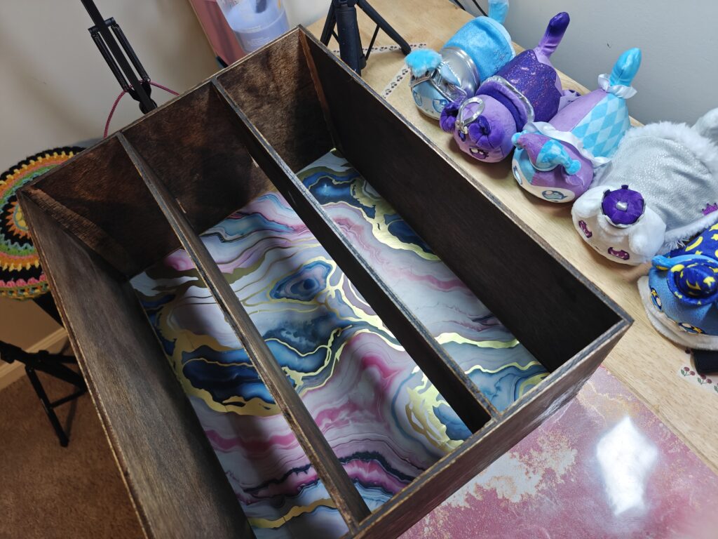
The back of the unit and the inside of the drawers felt a little too plain, so I added contact paper to bring in even more color and pattern. I found a colorful wallpaper-style contact paper at Dollar Tree that matched the fun new background on my desk, so it felt like the perfect choice.
Getting the contact paper inside the drawer unit was not easy because the shelves do not come out, but it was worth the effort. Now, every time a drawer opens, there is a fun patterned surprise inside instead of plain unfinished wood. It is one of those details that makes the whole makeover feel more intentional.
Creating a Drawer Pull Guide
While the paint dried, I made a paper guide to help place the drawer pulls in the center of each drawer. I cut a piece of paper to size, folded it to find the center, and marked where the screw holes needed to go. Then I adjusted the same guide for the smaller drawers by folding the sides in evenly.
This step helped make the hardware placement feel much less intimidating. Instead of measuring every drawer from scratch or guessing where each pull should go, the guide gave me a simple way to keep everything lined up. The large drawer was a little different, but by that point, I was confident enough to wing it.
Painting the Base Colors
For the colorful side, I chose three of my favorite colors: pink, blue, and purple. Since the Moppe has six drawers, I painted two drawers in each color. I also made a mockup first so I had a clear idea of how I wanted the colors arranged before committing to the final design.
The goal was to make this side feel playful, bright, and full of personality. The darker stained side would be moody and apothecary-inspired, while this side would be the complete opposite: bold, colorful, and chaotic in the best way.
Painting the Patterned Drawers
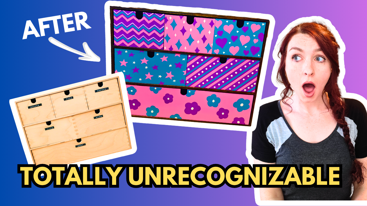
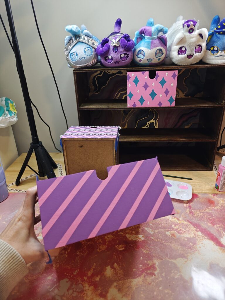
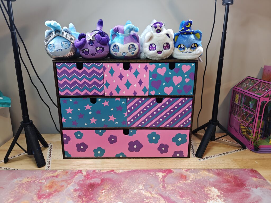
Once the base colors were done, I added a different pattern to each drawer. The pink drawers got sparkles and simple five-petal flowers. The purple drawers got diagonal stripes and a zigzag pattern. The blue drawers got stars and hearts.
Each drawer had its own personality, but the limited color palette helped them still feel like a set. I used washi tape for the diagonal stripes, which made the lines much cleaner and gave me some very satisfying tape pulls. The zigzag drawer was harder because I could not figure out how to tape it off neatly, so that one had a more handmade look. The heart drawer also took more coats than expected because the pink needed a lot of layering to look finished.
Even with the little challenges, this was the most fun part of the whole makeover. Watching each drawer go from a solid color to a finished patterned design made the entire piece come to life.
Adding Clear Coat and Label Pulls
After the painted drawers were finished, I added a clear coat to help protect the designs. Since this is a functional storage piece, I wanted the painted side to hold up to regular use.
For the apothecary side, I added label drawer pulls. To place the hardware, I used a clever lipstick trick to mark where the holes needed to go. The best part about using lipstick is that it wipes off easily, unlike paint, and it helped avoid guessing or doing too much math. The drilling seemed intimidating at first, but with the right spade bit, it was much easier than expected.
Once the label pulls were attached, the moody side had that vintage apothecary cabinet feeling I was hoping for.
The Finished Colorful Side
The colorful side of the IKEA Moppe turned out bright, playful, and full of energy. The pink, blue, and purple drawers each have their own hand-painted pattern, including sparkles, flowers, stripes, zigzags, stars, and hearts. It feels like the kind of storage piece I would have absolutely loved in my room as a kid, but it still works perfectly in a fun creative space now.
This side is definitely the statement side. It is bold, cheerful, and a little chaotic in the best possible way.
The Finished Apothecary Side
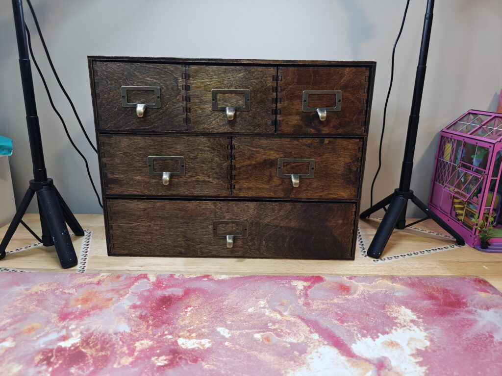
The opposite side has a completely different personality. With the darker stained wood and label drawer pulls, it feels more classic, moody, and apothecary-inspired. I love that the same drawer unit can look playful and colorful from one side, then more mature and vintage from the other.
This reversible design is perfect for an indecisive creative space because I do not have to choose between colorful and classy. I can have both.
Final Thoughts
This IKEA Moppe makeover was one of my favorite DIY transformations because it turned a simple $40 drawer unit into something completely custom. The colorful side is bright and whimsical, while the stained apothecary side is darker and more versatile. Adding wallpaper backing, hand-painted drawer designs, clear coat, and label pulls made the whole piece feel finished from every angle.
I love that this project combines practical storage with creative expression. Whether I want an explosion of color or a calmer vintage look, this reversible Moppe gives me the best of both worlds.